
Sleep Eazy
Overview

Project: End‑to‑end UX/UI and brand design for a conceptual sleep‑tracking app, with a focus on simplicity and information display for a non-profit health and wellness client
Role: UX/UI Designer, end‑to‑end ownership
Team: Team of two, collaborative concept project
Timeline: 7 days from research through to final prototype
Platform: Responsive app design
Skills: Opportunity identification • User research • UX strategy • App concept design • Prototyping & testing • Brand identity development


Design thinking process
Empathise
Secondary research
Competitor analysis
User survey & interviews
Define
User persona
User journey
Problem statement
Ideate
Initial sketches
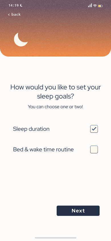
MoSCoW Matrix
Happy path
Prototype
Lo-fi & mid-fi prototypes
Brand design
Hi-fi prototypes
Test
User testing
Design iterations
Desirability testing
Client
A not-for-profit client in the health and wellness industry with an established, but diminishing, online subscription membership model.
Brief
Design a sleep-tracking app, with options for users to edit, share and delete their goals, data and profiles. Designed to promote long-term use and ultimately improve users’ health. Plus a fresh, new brand design to attract new users.
Desk research
The global sleep industry is currently worth $432b and is forecast to reach $585b by 2024 (Statista, 2022). Sleep industry here means anything relating to sleep — from pillows to sleeping pills and a growing sleep tech area. Interest in sleep health has increased in recent years as people’s understanding of the importance of sleep, and the negative impacts of poor sleep on health, has increased.
As part of our secondary research, we found other popular apps already in the sleep wellness genre. The three that stood out were Headspace, Calm and Sleep cycle. Whilst the first two have sleep-related features, Sleep cycle focuses on sleep only with a lot of detail and compatibility with smart watches.
Industry &
Competition

Primary research
Survey
Our app is needed!
Our survey gathered 55 responses in total over three days. We gauged current attitudes towards sleep health and learned about factors that users want to track.
Everyone surveyed was aware that sleep impacted their health and the majority wanted to improve their sleep and reported feeling that they were not getting the right amount of sleep.


Interviews → Quotes
→ Affinity diagram → Insights

Interview findings
We interviewed five users, with varying levels of satisfaction with their sleep.
Half the interviewees who already slept well were most interested in improving their quality of sleep so that they could sleep less in order to do more in their day.
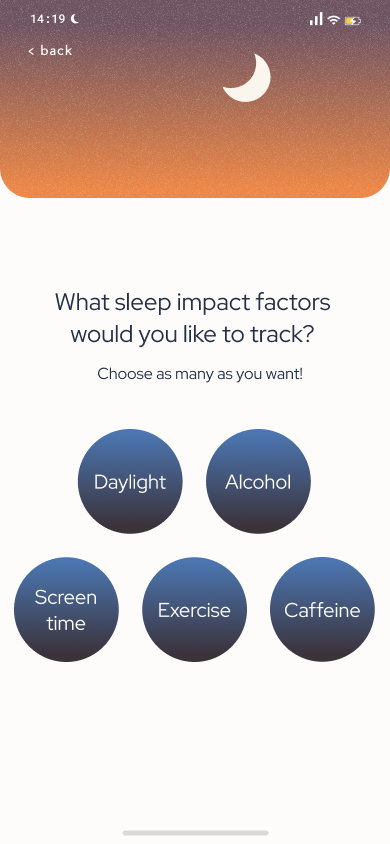
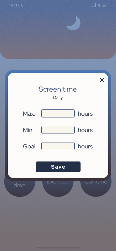
Users were keen to track environmental and behavioural factors in their day that may impact their sleep quality. The main factors mentioned were exercise, alcohol, caffeine and evening routines however there was a clear leader — screen time.
Regarding health tracking apps that interviewees already used, they included Apple Health, Google fit and Sleep cycles. The complaint from the first two apps was that they were not specialised enough in the area of sleep, and for the latter, sleep cycles, the issue was that it was overly complex.
Users reported favouring simplicity and speed of use to foster prolonged use.
On repeated use & sharing info
If I see improvement visually in a tracking app, that motivates me. I don’t want to share my sleep info with anyone!

On sleep impact factors
I don’t know how badly [screen time] is affecting me so I don’t know how much better I would be without them.
On design
It is a big thing for me to have a beautiful, fun interface to see my progress.
User persona
Distilled from user and survey respondents and our guiding star for the rest of the project!
Tired Tristan is busy and fatigued, trying to work hard but waking up tired means he struggles to function at work, leaving him frustrated. He knows sleep is important to his health but isn’t sure which factors in his day impact his sleep. He spends a lot of time staring at screens for work and is seeking a simple and quick experience. Many of our users mentioned that this would improve the likelihood of them using the app long-term.
User journey
This is also based on primary research and competitor research of other apps in the market.
Fatigue means he can’t perform during the day - which he finds frustrating. Tristan feels relief at finding an app specific to his needs... But then is frustrated again - it’s overly complicated and doesn’t let him track what impacts his sleep.
Click to expand


Problem statement
This took a few iterations!
We wanted to be sure we balanced the client’s goals of improving overall health and our user’s desire for the autonomy to see the information presented and make their own informed but realistic lifestyle adjustments through positive reinforcement.
Time and energy-poor millennials need to find a way to understand how their lifestyle choices impact their sleep because they want to improve their overall energy levels and ultimate health.
MoSCoW matrix and happy path
We distilled our ideas into a MoSCoW matrix, and the final must-have features are shown here.
Everyone that we interviewed expressed their unwillingness to share their sleep goals/achievements/progress with other app users. This included friends and strangers. With this in mind, we removed the sharing functionality even though it was referenced in the original client brief.
These features were ordered into a user flow, showing Tired Tristan’s path through that app on first sign-up and then his options as an existing user from the dashboard.
Ideation and prototyping
Ideation sketches
Lo-fidelity
Mid-fidelity
Lo-fi sketches, user testing and refinement were our next steps.
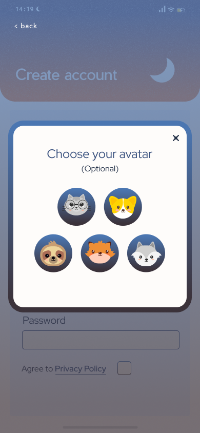
During the creation of the lo-fi sketches, we separated the onboarding questions onto individual screens for simplicity so as to not overwhelm the user on their first foray into the app. One design concept we talked about involved using sliders, similar to those founding Instagram stories, to gauge people’s answers. The benefits were that they were rapid and simple to use.
Lo-fidelity
Click to play
From user testing, we updated a few elements, including adding arrows to show users how to use the interactive slider bars and moving the settings into the bottom RH of the menu bar.
Mid-fidelity
Click to play
Mid-fis were our next step. After testing these we actually got rid of the slider bars in the onboarding questions to answer y/n questions as users still weren’t intuitively using them — even with arrows to show how they functioned.
Slider refinement
On reflection, the slider concept was just confusing users. We changed the binary sliders to more familiar checkboxes. The sliders remained in the range questions eg. entering how many hours of sleep they got.
We used slider-style infographics to report the user's sleep progress/tracking data on the dashboard. Users testing our mid-fi thought these reporting bars, designed to convey not collect information, had some kind of interactive features and incorrectly thought that they had to manipulate them to enter their tracking data.
These bars were redesigned so, instead of featuring the circles on the bars they had flat lines showing the different measurements. In the following tests users said they understood the dashboard bars not to be interactive — Success!

Branding
We dove right into the brand design, choosing to start with developing our moldboard before distilling our keywords or looking into the completion to limit subconscious design choices from the competition.
Brand values
Mellow
Restful
Restful
Relaxing
Warming
Nocturnal
Competition
The main themes from a visual competitors analysis were the use of clean sans serif fonts, gradients and a scientific/modern feel. All had stayed simple in their design choices.

Style tile
With a solid understanding of the user, key brand values and competition we developed our visual identity.
We chose two similar fonts (PP Pier Sans and Red Hat Display) instead of one font to add a subtle sense of hierarchy.
Calming blue and sunset orange were made into gradients which had a slight grain overlay, the goal of which was to create texture and move away from the overly polished visuals of our competitors.
These all combined, with some simple graphics, to form our logo. We pulled our brand name out of thin air, however — since completing this project we found out there is, in fact, a sleep app called Sleep Easy which we were not aware of at the time.

Hi-fidelity prototype
Unmute for my guided walkthrough and design insights.


Dashboard design iterations
Empty states
Our prototype features empty states, helping guide the user seamlessly along the happy path. Click to expand.
Hi-fi testing
Whilst desirability testing the final design, key themes shared by users were that they found the app, ‘Clear, useable and calming’.
Users were visibly delighted by the unexpected animations we used throughout the app.
Reflections and next steps
Adding educational content including informational videos and short reads/podcasts on the subject of sleep and its impacts on health is the next step in this project. Another useful development would be to add features that support users in falling asleep — podcasts, bedtime reminders and peaceful sound recordings. Finally, using data from our survey, there is definitely scope for a wider tranche of impact factors to track eg. stress levels, sugar intake and outdoor time.
With this project we found ourselves limited by the lack of opportunity to connect a tracking device (eg. smartwatch) to the app. Users said this was a favourable option, more accurate than self-reporting. We would have liked to interview a specialist on the subject of sleep.
The main learning was that simplicity is of paramount importance for repeated use of the app and flexibility in goal-setting apps is important as different users’ health values are so varied.
Finally, users love unexpected animations — it was very rewarding during the desirability testing of the final hi-fi to see users' delight at our work!

Finally
I would like to thank my teammate Mia who was my colleague on this project.
If you are interested in collaborating on a project or expanding your full-time UX team, get in touch.